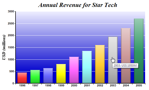
开发人员在使用图表可视化展示数据时经常会用到图表的向下钻取功能,该功能就是当用户点击图表中的数据点时,会弹出另外一个图表来显示该数据点的详细数据,如在咱们的应用中有一个柱状图表,每个柱状图中的柱子即一个数据点,表示每一年某个产品的销量,可是在每一年里具体每个月份的销量就没有具体显示在图表中,那么我们可以通过点击柱状图中的某一个柱子就弹出一个图表用于显示该年下每个月份的销售量。
ChartDirector是一款多平台下的综合图表控件,通过该图表产品,开发人员可以轻松实现上述功能,下面的事例就在Asp.net下如何实现该功能做阐述,具体其他开发语言的代码可以查看产品提供的相关帮助文档和事例。
1.首先在主页面创建一个柱状图表
<%@ Page Language="C#" Debug="true" %>
<%@ Register TagPrefix="chart" Namespace="
ChartDirector" Assembly="netchartdir" %>
<!DOCTYPE html>
<script runat="server">
//
// Page Load event handler
//
protected void Page_Load(object sender, EventArgs e)
{
// The data for the bar chart
double[] data = {450, 560, 630, 800, 1100, 1350, 1600, 1950, 2300, 2700};
// The labels for the bar chart
string[] labels = {"1996", "1997", "1998", "1999", "2000", "2001", "2002", "2003", "2004",
"2005"};
// Create a XYChart object of size 600 x 360 pixels
XYChart c = new XYChart(600, 360);
// Add a title to the chart using 18pt Times Bold Italic font
c.addTitle("Annual Revenue for Star Tech", "Times New Roman Bold Italic", 18);
// Set the plotarea at (60, 40) and of size 500 x 280 pixels. Use a vertical gradient color from
// light blue (eeeeff) to deep blue (0000cc) as background. Set border and grid lines to white
// (ffffff).
c.setPlotArea(60, 40, 500, 280, c.linearGradientColor(60, 40, 60, 280, 0xeeeeff, 0x0000cc), -1,
0xffffff, 0xffffff);
// Add a multi-color bar chart layer using the supplied data. Use soft lighting effect with
// light direction from top.
c.addBarLayer3(data).setBorderColor(Chart.Transparent, Chart.softLighting(Chart.Top));
// Set x axis labels using the given labels
c.xAxis().setLabels(labels);
// Draw the ticks between label positions (instead of at label positions)
c.xAxis().setTickOffset(0.5);
// When auto-scaling, use tick spacing of 40 pixels as a guideline
c.yAxis().setTickDensity(40);
// Add a title to the y axis with 12pt Times Bold Italic font
c.yAxis().setTitle("USD (millions)", "Times New Roman Bold Italic", 12);
// Set axis label style to 8pt Arial Bold
c.xAxis().setLabelStyle("Arial Bold", 8);
c.yAxis().setLabelStyle("Arial Bold", 8);
// Set axis line width to 2 pixels
c.xAxis().setWidth(2);
c.yAxis().setWidth(2);
// Create the image and save it in a temporary location
WebChartViewer1.Image = c.makeWebImage(Chart.PNG);
// Create an image map for the chart
WebChartViewer1.ImageMap = c.getHTMLImageMap("clickline.aspx", "",
"title='{xLabel}: US$ {value|0}M'");
}
</script>
<html>
<head>
<title>Simple Clickable Bar Chart</title>
</head>
<body style="margin:5px 0px 0px 5px">
<div style="font:bold 18pt verdana">
Simple Clickable Bar Chart
</div>
<hr style="border:solid 1px #000080" />
<div style="font:10pt verdana; margin-bottom:1.5em">
<a href='viewsource.aspx?file=<%=Request["SCRIPT_NAME"]%>'>View Source Code</a>
</div>
<chart:WebChartViewer id="WebChartViewer1" runat="server" />
</body>
</html>
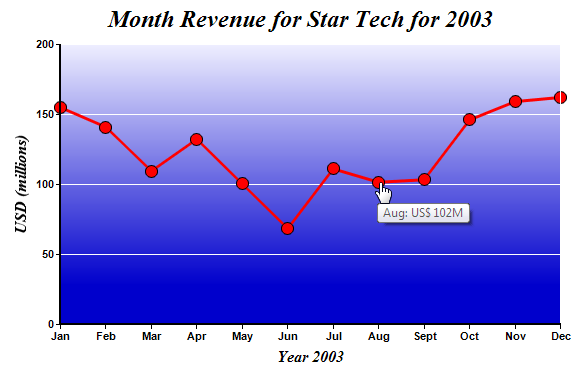
2.当点击每个柱状图中的柱子时,会弹出一个页面显示一个线形图表,表示每个月份的数据
<%@ Page Language="C#" Debug="true" %>
<%@ Register TagPrefix="chart" Namespace="
ChartDirector" Assembly="netchartdir" %>
<!DOCTYPE html>
<script runat="server">
//
// Page Load event handler
//
protected void Page_Load(object sender, EventArgs e)
{
// Get the selected year.
string selectedYear = Request["xLabel"];
//
// In real life, the data may come from a database based on selectedYear. In this example, we
// just use a random number generator.
//
int seed = 50 + (int.Parse(selectedYear) - 1996) * 15;
RanTable rantable = new RanTable(seed, 1, 12);
rantable.setCol2(0, seed, -seed * 0.25, seed * 0.33, seed * 0.1, seed * 3);
double[] data = rantable.getCol(0);
//
// Now we obtain the data into arrays, we can start to draw the chart using
ChartDirector //
// Create a XYChart object of size 600 x 320 pixels
XYChart c = new XYChart(600, 360);
// Add a title to the chart using 18pt Times Bold Italic font
c.addTitle("Month Revenue for Star Tech for " + selectedYear, "Times New Roman Bold Italic", 18)
;
// Set the plotarea at (60, 40) and of size 500 x 280 pixels. Use a vertical gradient color from
// light blue (eeeeff) to deep blue (0000cc) as background. Set border and grid lines to white
// (ffffff).
c.setPlotArea(60, 40, 500, 280, c.linearGradientColor(60, 40, 60, 280, 0xeeeeff, 0x0000cc), -1,
0xffffff, 0xffffff);
// Add a red line (ff0000) chart layer using the data
ChartDirector.DataSet dataSet = c.addLineLayer().addDataSet(data, 0xff0000, "Revenue");
// Set the line width to 3 pixels
dataSet.setLineWidth(3);
// Use a 13 point circle symbol to plot the data points
dataSet.setDataSymbol(Chart.CircleSymbol, 13);
// Set the labels on the x axis. In this example, the labels must be Jan - Dec.
string[] labels = {"Jan", "Feb", "Mar", "Apr", "May", "Jun", "Jul", "Aug", "Sept", "Oct", "Nov",
"Dec"};
c.xAxis().setLabels(labels);
// When auto-scaling, use tick spacing of 40 pixels as a guideline
c.yAxis().setTickDensity(40);
// Add a title to the x axis to reflect the selected year
c.xAxis().setTitle("Year " + selectedYear, "Times New Roman Bold Italic", 12);
// Add a title to the y axis
c.yAxis().setTitle("USD (millions)", "Times New Roman Bold Italic", 12);
// Set axis label style to 8pt Arial Bold
c.xAxis().setLabelStyle("Arial Bold", 8);
c.yAxis().setLabelStyle("Arial Bold", 8);
// Set axis line width to 2 pixels
c.xAxis().setWidth(2);
c.yAxis().setWidth(2);
// Create the image and save it in a temporary location
WebChartViewer1.Image = c.makeWebImage(Chart.PNG);
// Create an image map for the chart
WebChartViewer1.ImageMap = c.getHTMLImageMap("clickpie.aspx?year=" + selectedYear, "",
"title='{xLabel}: US$ {value|0}M'");
}
</script>
<html>
<head>
<title>Simple Clickable Line Chart</title>
</head>
<body style="margin:5px 0px 0px 5px">
<div style="font:bold 18pt verdana">
Simple Clickable Line Chart
</div>
<hr style="border:solid 1px #000080" />
<div style="font:10pt verdana; margin-bottom:1.5em">
<a href='viewsource.aspx?file=<%=Request["SCRIPT_NAME"]%>'>View Source Code</a>
</div>
<chart:WebChartViewer id="WebChartViewer1" runat="server" />
</body>
</html>