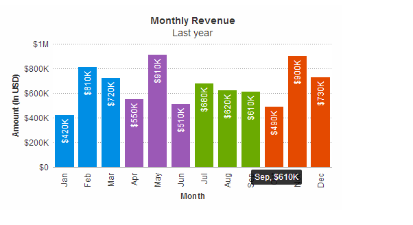
FusionCharts Suite XT可以为数据绘制区域内的元素设置颜色,设置透明度、边框以及其他效果,下面这个事例主要讲如何为不同的数据点分别设置不同的颜色,效果图以及事例如下:
{
"chart": {
"caption": "Monthly Revenue",
"subCaption": "Last year",
"xAxisName": "Month",
"yAxisName": "Amount (In USD)",
"numberPrefix": "$",
"theme": "fint"
},
"data": [
{
"label": "Jan",
"value": "420000",
"color": "#008ee4"
},
{
"label": "Feb",
"value": "810000",
"color": "#008ee4"
},
{
"label": "Mar",
"value": "720000",
"color": "#008ee4"
},
{
"label": "Apr",
"value": "550000",
"color": "#9b59b6"
},
{
"label": "May",
"value": "910000",
"color": "#9b59b6"
},
{
"label": "Jun",
"value": "510000",
"color": "#9b59b6"
},
{
"label": "Jul",
"value": "680000",
"color": "#6baa01"
},
{
"label": "Aug",
"value": "620000",
"color": "#6baa01"
},
{
"label": "Sep",
"value": "610000",
"color": "#6baa01"
},
{
"label": "Oct",
"value": "490000",
"color": "#e44a00"
},
{
"label": "Nov",
"value": "900000",
"color": "#e44a00"
},
{
"label": "Dec",
"value": "730000",
"color": "#e44a00"
}
]
}